Video tutorial
Written steps
Before starting
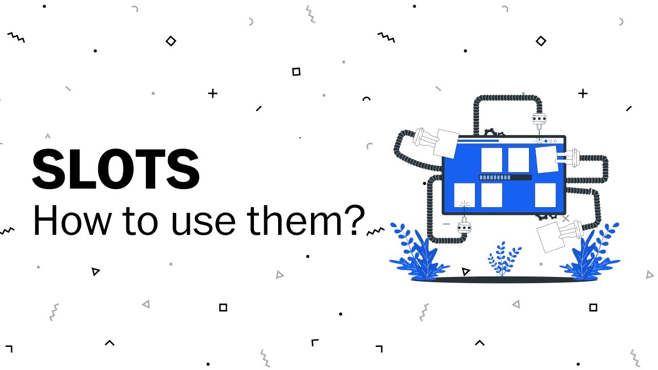
Slots are not an actual componet you will find in our coded design system but rather a figma only component that's only purpose is to be swapped out for a pattern, or local component you are designing. When you see a slot either by how its labeled or its name in the layer of a component you can be sure it is a signal for you to replace it with your own local component.
When to use
Slots are used to avoid having to detaching a component to access nesting content inside of it. For example a tooltip or accordion can hold a lot of different type of content. Rather than the figma component accounting for ever possible variation it is better to just have slot. This then allows for infinite possiblities without having to detach at all.
The steps
- First be sure that the component either has a slot by name or you have asked if it is okay to replace.
- Create your local pattern either using our library of components or just our foundaitons like our typography tokens. This could be anything a headline with a blurb or a image with a headline.
- Be sure to frame the entire pattern and name it appropriately.
- Add an auto layout to the frame and convert it to a local component.
- Select the slot in the component and replace it with the local component.
- Done!
Common pitfalls
Sometimes things do not look right when you replace the slot if this is the case check the following:
- Does you component have a auto-layout and is it position correctly.
- Check the nested version of your component and be sure the it is sized appropriately either fill-container or hug-contents.