Buttons
Buttons allow users to perform an action with a single tap. Buttons also serve as a way for a call to action.
Anatomy
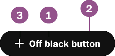
Legend
- Button text
- Button theme
- Icon
Options
Icon
Icons can be used on the left or right of the button text.
Color Themes
Buttons have various themes that can be used. Each theme has hover, active, and focus states predefined. The most common themes used are Offblack, White, and Subs-Blue Note: to see all color themes, please see our color tokens
Button Sizes
Button has three sizes large, medium and small.
Note: Large button should only be used on subscription pages or when there two lines of text
Button Sizes
Button has three sizes large, medium and small.
Note: Large button should only be used on subscription pages or when there two lines of text
Logos
Logos are available to be used instead of icons and only be used in the context of the branding of that logo.
Behaviors
Hover
Buttons are consistent with our color themes. Note: to see all color themes please see our color tokens
Active
Buttons are consistent with our color themes Note: to see all color themes please see our color tokens
Disabled
All buttons share the same disabled state.
Usage guidelines
Avoid multiple lines for same sentence
Multiline button support is reserved for subscription focus CTA, but never should the multiline continue the same sentence.
Do not stack buttons of different widths.
Buttons should take on the full width of the longest button to avoid weird stacking widths.
Pair the appropriate sized button
Always pair the small button when pairing with a smaller UI element that is inline.

Avoid full width buttons
Full-width buttons are reserved for the mobile screen when buttons stack and take up the full container when appropriate. Still when using full-width options buttons should not be obnoxiously large
Stacking Buttons
When stacking buttons use 4px (-xs) spacing for both medium and small.
Specs
Size Default
Button width is dependent on either the fixed padding with the button text or if the button is set to the fullWidth of the container

Size Small
Button width is dependent on either the fixed padding with the button text or if the button is set to the fullWidth of the container

Component Checklist
Visual information required to identify components and states (except inactive components) has a contrast ratio to meet WCAG 2.0 level AA. This exclude text contrast requirements. Unless disabled text should always be accessbile.
Includes all interactive states that are applicable (hover, down, focus, keyboard focus, disabled).
Sizing, spacing, and other visual styles have been outline in documentation and the coded component has been VQA to match
Considerations have been made to think in darkmode, lightmode, button themes and other applicable themes
Includes relevant options (variant, style, size, orientation, optional iconography, decorations, selection, error state, etc.)
Includes guidelines for keyboard focus, layout (wrapping, truncation, overflow), animation, interactions, etc.
A equivalent design component as been created matching as best as possible to properties found in the coded component.
Component can scale for all platforms mobile, tablet, and desktop.
Component has an opinion on how it scales on Homepage columns and other modular layouts.
Component can be used in iOS and Andriod or has an equivalent app component
Follows WCAG 2.0 standards for keyboard accessibility guidelines and includes a description of the keyboard interactions.
All design attributes (color, typography, layout, animation, etc.) are available as design tokens.
Meets minimum requirements to ensure minimal impact to Web vitals. (Skeleton loads, Animations, Avoid layout shift, etc.)