Option Pill
An Option Pill can represent an input, attribute, or action. An Option Pill allows users to trigger actions, like links to points of interest. While buttons are expected to appear consistently and with familiar calls to action, Option Pills can appear dynamically, either individually or as a group.
Anatomy
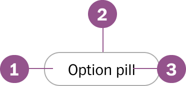
Legend
- Background
- Border
- Text
Behaviors
Active
When a option pill is selected it is active until unselected.
Usage guidelines
Pill vs buttons
Option pills should only be used to present a set of options. In the example, all pills are, in fact, user options. They represent user actions that are not related. The actions should be related, such as links to stories, categories, or filters.
Wrap when needed
By default option pills do not wrap when grouped. When appropriate and all options need to be in view, have the option pills wrap.
Specs
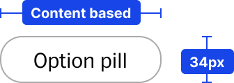
Size
Pills will take the width of the text content and not wrap the text. The height
is a fixed height of 34px.
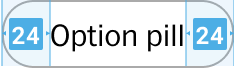
Spacing
Text within the option pill is vertically aligned with 24px left and right.
Component Checklist
Visual information required to identify components and states (except inactive components) has a contrast ratio to meet WCAG 2.0 level AA. This exclude text contrast requirements. Unless disabled text should always be accessbile.
Includes all interactive states that are applicable (hover, down, focus, keyboard focus, disabled).
Sizing, spacing, and other visual styles have been outline in documentation and the coded component has been VQA to match
Considerations have been made to think in darkmode, lightmode, button themes and other applicable themes
Includes relevant options (variant, style, size, orientation, optional iconography, decorations, selection, error state, etc.)
Includes guidelines for keyboard focus, layout (wrapping, truncation, overflow), animation, interactions, etc.
A equivalent design component as been created matching as best as possible to properties found in the coded component.
Component can scale for all platforms mobile, tablet, and desktop.
Component has an opinion on how it scales on Homepage columns and other modular layouts.
Component can be used in iOS and Andriod or has an equivalent app component
Follows WCAG 2.0 standards for keyboard accessibility guidelines and includes a description of the keyboard interactions.
All design attributes (color, typography, layout, animation, etc.) are available as design tokens.
Meets minimum requirements to ensure minimal impact to Web vitals. (Skeleton loads, Animations, Avoid layout shift, etc.)